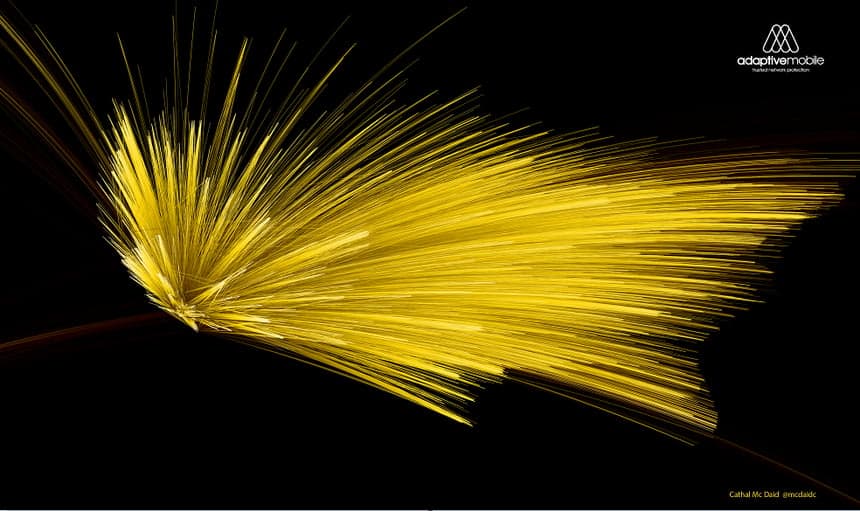
Visualizing SMS Attacks in North America
A map is an incredible concept, if you consider it. A visualization that tells you in one glance the shape of things relative to what lies around them. No other image can give that much information.
I thought about this while we were trying to make sense of the flood of text messaging spam data we work with. Mobile spam can be a difficult subject to explain and put into context, like many areas of cyber-security there has been a huge element of uncertainty of what the real threat is, and this leads to unrealistic numbers being used by those who don’t have access to the true data. At the same time, we’ve become aware that there is a sea-change happening within the mobile spam environment in North America. As our defenses are getting better, spammers are switching from sending with phones from the ‘traditional’ mobile operators, to sending spam from VoIP operators. I debated how best to communicate this. The maxim: “If you’re explaining, you’re losing” was on my mind – I needed visuals. But while stats and bar-charts are good, I felt they didn’t give the full story.
The inspiration came while researching a recent Canadian spam attack. Here it seemed clear that the spammers had not just selected random areas; they had focused on a specific province, and more to the point, specific towns within it. They were able to do this because they knew what mobile phone numbers from those towns should look like. Unlike most countries who have dedicated telephone codes for mobile, the United States (& Canada) are some of the few countries in the world that have geographic numbering for mobile phones. As members of NANPA – the North American Numbering Plan – they assign numbers for mobiles based on where they are registered, or exchanges. This registration is indicated by the first six digits of a phone number, where the first three digits is the area code (NPA), and the next three is the exchange code (NXX). This NPA-NXX is obviously not the true location, someone could buy a phone in New York, and use it anywhere in the US, (or the world for that matter) but it does allow a means for spammers to target certain areas they want to spam.
I had been working on visualizations in other areas, and then it dawned to me that this pseudo-location information could be used to visualize spam activity within North America in a way that hadn’t be done before. With this I set to work.
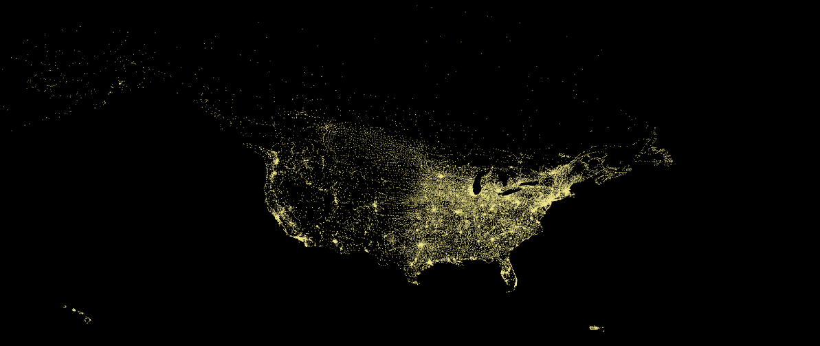
Map of NPA-NXX Exchange Database for US, Canada, Puerto Rico & US Virgin Islands. One dot equals one exchange
First off, I needed to have the physical locations of the exchange codes. This was the most difficult part, the US & Canadian NANPA codes themselves are freely available, though they can be hard to find. However, while there are some free sources of exchange codes and latitude/longitude available I found several locations and codes in them inaccurate or out of date. Cue many, many days of trying to reconcile the data together from several different sources, and for new NPA-NXXs to be geo-located. After many frustrating iterations and sanity checking I eventually created a robust NPA-NXX database which contained US, Canadian & Puerto Rican/Virgin Islands exchanges. I didn’t expand further to cover the other, mostly Caribbean, NANPA countries as even though they are in NANPA, many of them don’t allocate mobiles geographically to any degree.
Next for the input data & algorthim; I used random samples from September and October of spam messages that had been blocked. I normally used sets of 1 Million spam ‘events’ for the visuals, although in one case I used more. These events consisted of anonymized, sender/receiver NPA-NXX pairs. The actual code for the visualization itself was done in python, and is basically a variant of the Great Circle Maps python code by Paul Butler, based on the R code he wrote to create the fantastic Facebook relationship map. Without this the visuals would never have been possible. The reason I used this is that I loved the idea of generating the visuals from activity only, with no underlying map or background – the United States’ population on both coasts allows this – plus it looked cool.
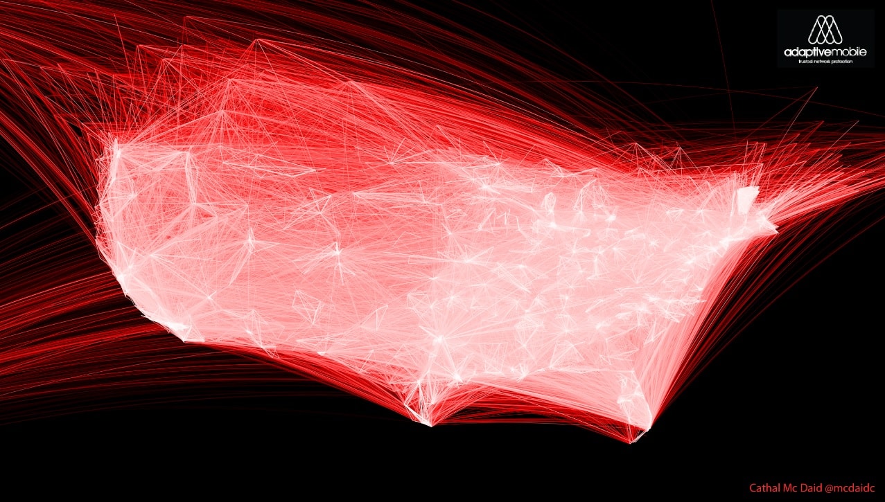
Original visualization of VoIP Carrier Spam – same colour for source and destination
One modification I did do was to show the source and destination differently. I tried a few different methods, but eventually settled on varying the brightness of each great circle segment of the message path, with the brighter end representing the destination. I did this as unlike the Facebook map, where connections have the same meaning for both participants, spam messages clearly don’t. I also ran some early experiments on Nathan Yau’s excellent tutorial and code for the R equivalent, but R’s rendering performance I found much slower on the systems I ran them on. Finally, combining the spam data, the locations and the algorithm allowed me to produce the visuals released today.
These visuals show a wealth of stories in the war on mobile spam – who are the main targets, where it is coming from and so on. Inspired by another great FlowingData tutorial, I also used the data to provide the spam per US counties map – I did this by assigning the exchanges to county and mapping all ~10 million spam messages we detected and blocked during the two month period. For the first time, this give a real, quantitative view of what is happening within the United States, and I hope to release more analysis from this set as time goes on. While this analysis is interesting, I was pleased that I could also show visually the changes that are happening in mobile spam. As mentioned earlier, we know spammers are moving away from wireless carriers (the traditional big telcos we all know), due to improvements in defenses, and moving to send from VoIP carriers. While spam from Wireless operators looks like it originates from only a few key points, spam from VoIP carriers look like it comes from everywhere. This is because if you sign up for an account from a VoIP carrier, you can decide then and there what area code/area you want to use, this means North America seems to ‘glow’ with VoIP carrier spam.
This isn’t the first time that messaging and calls has been visualized (AT&T, IBM & MIT did a very interesting one a few years ago, which uses ‘true’ location information) but what we’ve released is the first visualization of mobile spam patterns. I hope you find them interesting, and I leave you with a high-res version of possibly my favourite image, a Californian originated ‘pump and dump’ spam attack, that attempted to storm across the continent in September. With this improved intelligence, we can all better marshal our defences.
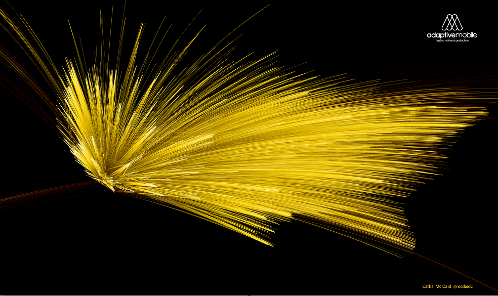
View High-Res version of California Pump’n’Dump Spam (Warning – 3.6MB)
